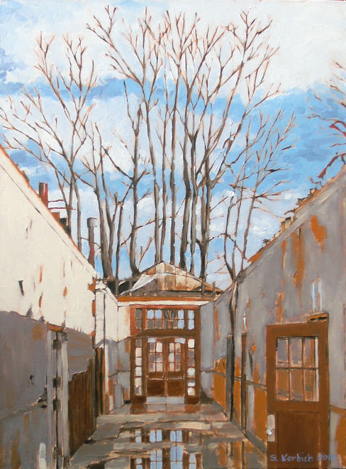
My First Art Opening

The painting continues...time is moving quickly these days...


Thursday, October 7, 2010

William Wray

I can across William Wray's work in a comic book store of all places. This is probably because he worked (works?) in the comic/cartoon industry.
He has a style that I really admire and I get inspiration from his work.
William works in oil paint and has a great loose technique, augmenting a potentially banal scene with color and light.
Check out his blog to learn more...
http://williamwray.blogspot.com

This cityscape has a wonderfully dark feel to it. To me, it looks like a labyrinth's edge, or a fortress wall. Beyond is a bridge to something light. The glow of the refelected low sun in the valley of the street adds incredible depth to this piece.


William lives in Southern California and much of his artwork uses imagery from the gritty urban landscapes around him.
Here, he embelishes a funky old carport and uses power poles and yellow curb to frame the scene. I like that he is not afraid to work the dark, shady areas and takes vantage points where he is looking towards the light source . Notice the detail of the car at the left side, with it's red tail lights. Cool.

Monday, October 4, 2010

Marysville Paintings on Display


I finally got the Marysville paintings up on display at a local cafe.
The Eclectic Kitchen (4936 NE Fremont) was nice enough to allow me to nail up the five paintings.
Please stop but, have a coffee and one of their tasty pastries and have a look at the art.
The space is great for displaying art and the lighting is very good. This will be a nice home for these paintings for a few months.

http://www.eclectickitchenpdx.com/

Sunday, October 3, 2010

Basics

After finishing the Morrison Bridge painting, I decided that I needed to simplify what I am doing. The Marysville paintings have a quality of light and subject that are working for me. I am interested in the bits an pieces of urban life. These are the places and things that we miss while going about our busy lives.
I am interested in the layering that is happening here. The power cables are an interesting middle ground, which make for a framework for the rest of the image.
The sense of solid and void, light and dark are compelling. We will see if this works in the final run, but I am feeling good about it.
My hope is to create paintings that someone can recognize but also see as an abstract composition.
I was thinking about doing a large version of this, but wanted to start something.

child art


It is great to watch children make art. They are so loose with the way they express themselves and it can be very refreshing to see what they come up with.
Here, Aidan and Natasha draw with chalk on our old concrete driveway walls. They have very different "styles" if you could call it that. Natasha was doing a dance of some kind, swinging the chalk in her hand and grazing the wall with short strokes, making the line drawing that you see. It has an abstract impressionism vibe. She used at least three different colors and seemed vary deliberate as to where she marked the concrete canvas.
Aidan's drawing has a cave painting, primitive feel to it. He is trying to show movement of the characters along the curve. As you can see, he wanted to make sure that everyone knows that this was his handiwork.
We took them to the art museum this afternoon. Aidan is always saying that art is boring or he will say "I could make that" while looking at some of the drawings. "You should do that then" I said to him. Natasha, on the other hand, seems to enjoy the museum.
I envy both their ability to work quickly and not over-think what they are making. They inspire me.

Wednesday, September 15, 2010

Hudson Valley School

The Hudson Valley School was a bunch of 19th century american artists who were in to sublime landscapes.

We have all seen these kinds of paintings in art museums and they are impressive.

In my previous post about the Morrison bridge painting, I was musing about the feel of the painting and how it felt old.
While I can't hold a candle to someone like Samuel Coleman's "Rainbow" painting shown here, I am thinking that the Morrison bridge painting has some similarities.

Try replacing the rainbow with the bridge in your mind.

Monday, September 13, 2010

Morrison


OK, I'm looking at the image of my painting above and am thinking that it looks like an early American landscape painting. Is that a good thing? It does not seem like a bad thing.
It certainly does not suck.
I would really like to be able to loosen up more.
Anyway...it is good (my wife said it was "good", which usually means that there is something that is bugging her about it)
I do like how the painting can out. The stretched out view shows the entire bridge span as well as the rivers edge. The sense of light is pretty good as it was on my way home from work at about 5:00 PM in the fall. Those clouds were really ominous looking and I thin that I captured the power of the sky here.
Reflections continue to be a challenge, but I did well here. I held back on too much detail on the water, which is good. One could paint ripples and waves forever...no thanks.
This 12 inch by 48 inch painting is for sale. Please buy it. It will look great over your sofa or flat screen TV. I am thinking $600 with a black hand crafted frame if you are interested. As usual, my photo does not do the painting justice, so please come see it in person.
Seriously, I need some cash for a better digital camera and to buy Mickey Mouse ears for my kids when we go to Disney Land in October. The only reason that we are going to Disney Land is that my wife has a fantastically generous sister who wants to get a picture with the kids and Mickey.

Sunday, September 12, 2010

Painting Gear

A lot of people ask me about my technique. They seem to be impressed that I use oil paints and consider them to be difficult and messy to work with.
They also consider them to be smelly.
Ok, oil paints can be all of these things, but are not necessarily any worse than acrylics.

Brushes:

I use what are called "Brights" which have a straight, flat bristle. I rarely use any rounds or beveled brushes. The brights can be used to make thick or thin strokes.
The smaller four here are what I generally use to do my painting, with the larger one being used for prepping backgrounds.
I don't have a favorite brand per say, I usually look for a good brush that is on sale.
I like the synthetics vs. the horse hair brushes because fo their uniformity and soft feel.


Paint:

I use walnut oil based paints by M. Gharam exclusively. My palette is currently what you see below.
Titanium White
Transparent Iron Ixide, dark and light
Van Dyke Brown
Yellow Ochre
Cerulean Blue
Ultramarine Violet
Ultramarine Blue
Cadmium Red, Light
Quinacridone Red
Olive Green
Cadmium Yellow


Solvents:

These are the things that have more toxic vapors. Thinners are used to make paints more runny and for cleaning brushes. I use a low odor type of mineral spirit, which helps make it easier to live with.
Medium is used to make the paint more fluid and hastens the drying time. This has an alkyd that is kind of nasty. I usually mix a little of the medium with my paint as I mix on the palette using the squeeze bottle you see here.
I keep a little walnut oil to use as a thinner as well. You could use the oil almost exclusively as a medium and to clean things. This would make it much less toxic.

I must stress that even though there are these so called "odorless" thinners, you need to always paint in a well ventilated space. I always have a fan going to move nasty vapors out of the room.
Even still, I need to take a break every hour or so to get some fresh air.
I wish that I could afford to build the studio in my backyard so that I would have more room and better ventilation.


I will have to talk about how I clean my brushes sometime.
Actually, I destroy my brushes, and just happen to run them under water and rub soap into them, which while necessary, seems futile.

Waste:

While taking a painting class I learned that you never have to trash your used thinner. Simply pour the dirty thinner into a mason jar, cover and wait a few days. The solids settle down to the bottom of the jar, leaving virtually clear thinner that you can reuse.
I have a mason jar that I have been using this way for two years now and it is just now getting to the top with sediments.

I have an old board that I wipe all my unused paint on. (it is always a challenge to waste as little paint as possible). This board must weight five pounds by now and I intend to keep piling on the paint. In contrast to acrylic paints, which "clean up" with water, there is little waste added to the water system.

I try to use old underwear and socks for rags. Old under shirts are the best. Once they are nice and dirty, I do need to dispose of them inthe trash. I probably use my rags for vehicle and household projects than I do for painting, which is sad.

I'm going to go out on a limb and say that oil painting is the greener alternative.