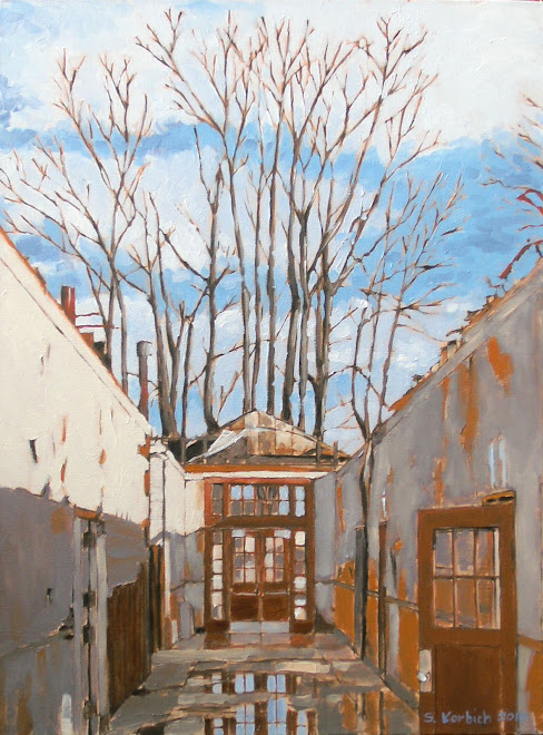
Here is the finished painting of the cable car towers.
The most trouble that I seemed to have with it is getting my signature to look right, which it still doesn't.
I have been concerned that my John Hancock looks a little sloppy and may need to invest in a very small brush. Some say that an artist should sign on the wet painting, which is difficult to do. I sure looks to me like others paint a signature onto dry paint.
It felt good to work on this. It was a rainy Sunday morning and it was great to just listen to music, paint and daydream.
My First Art Opening
The painting continues...time is moving quickly these days...
Sunday, October 10, 2010
Thursday, October 7, 2010
William Wray
I can across William Wray's work in a comic book store of all places. This is probably because he worked (works?) in the comic/cartoon industry.
He has a style that I really admire and I get inspiration from his work.
William works in oil paint and has a great loose technique, augmenting a potentially banal scene with color and light.
Check out his blog to learn more...
http://williamwray.blogspot.com
This cityscape has a wonderfully dark feel to it. To me, it looks like a labyrinth's edge, or a fortress wall. Beyond is a bridge to something light. The glow of the refelected low sun in the valley of the street adds incredible depth to this piece.
William lives in Southern California and much of his artwork uses imagery from the gritty urban landscapes around him.
Here, he embelishes a funky old carport and uses power poles and yellow curb to frame the scene. I like that he is not afraid to work the dark, shady areas and takes vantage points where he is looking towards the light source . Notice the detail of the car at the left side, with it's red tail lights. Cool.
Monday, October 4, 2010
Marysville Paintings on Display
I finally got the Marysville paintings up on display at a local cafe.
The Eclectic Kitchen (4936 NE Fremont) was nice enough to allow me to nail up the five paintings.
Please stop but, have a coffee and one of their tasty pastries and have a look at the art.
The space is great for displaying art and the lighting is very good. This will be a nice home for these paintings for a few months.
http://www.eclectickitchenpdx.com/
Sunday, October 3, 2010
Basics
After finishing the Morrison Bridge painting, I decided that I needed to simplify what I am doing. The Marysville paintings have a quality of light and subject that are working for me. I am interested in the bits an pieces of urban life. These are the places and things that we miss while going about our busy lives.
I am interested in the layering that is happening here. The power cables are an interesting middle ground, which make for a framework for the rest of the image.
The sense of solid and void, light and dark are compelling. We will see if this works in the final run, but I am feeling good about it.
My hope is to create paintings that someone can recognize but also see as an abstract composition.
I was thinking about doing a large version of this, but wanted to start something.
child art
It is great to watch children make art. They are so loose with the way they express themselves and it can be very refreshing to see what they come up with.
Here, Aidan and Natasha draw with chalk on our old concrete driveway walls. They have very different "styles" if you could call it that. Natasha was doing a dance of some kind, swinging the chalk in her hand and grazing the wall with short strokes, making the line drawing that you see. It has an abstract impressionism vibe. She used at least three different colors and seemed vary deliberate as to where she marked the concrete canvas.
Aidan's drawing has a cave painting, primitive feel to it. He is trying to show movement of the characters along the curve. As you can see, he wanted to make sure that everyone knows that this was his handiwork.
We took them to the art museum this afternoon. Aidan is always saying that art is boring or he will say "I could make that" while looking at some of the drawings. "You should do that then" I said to him. Natasha, on the other hand, seems to enjoy the museum.
I envy both their ability to work quickly and not over-think what they are making. They inspire me.
Subscribe to:
Posts (Atom)