My First Art Opening

The painting continues...time is moving quickly these days...


Monday, December 13, 2010

Trading Card Art


My wife gave me a pack of Strathmore Artist Trading Card blanks.
These are about the size of a business card and their origin is as follows, according to Wikipedia:

"Artist Trading Cards (or ATCs) are miniature works of art about the same size as modern baseball cards,[1] or 2 ½ X 3 ½ inches (63 mm X 89 mm),[2] small enough to fit inside standard card-collector pockets, sleeves or sheets.[3] The ATC movement developed out of the mail art movement and has its origins in Switzerland.[4] Cards are produced in various media, including dry media (pencils, pens, markers, etc.), wet media (watercolor, acrylic paints, etc.), paper media (in the form of collage, papercuts, found objects, etc.) or even metals or cloth. The cards are usually traded or exchanged rather than sold."

My wife has been bugging me to make something with them. This past weekend I sat down with my daughter to do some drawing and thought that it would be the perfect time to try them out.

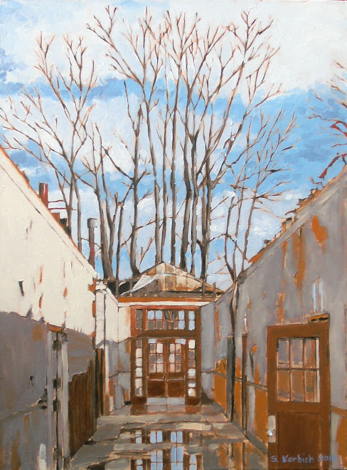
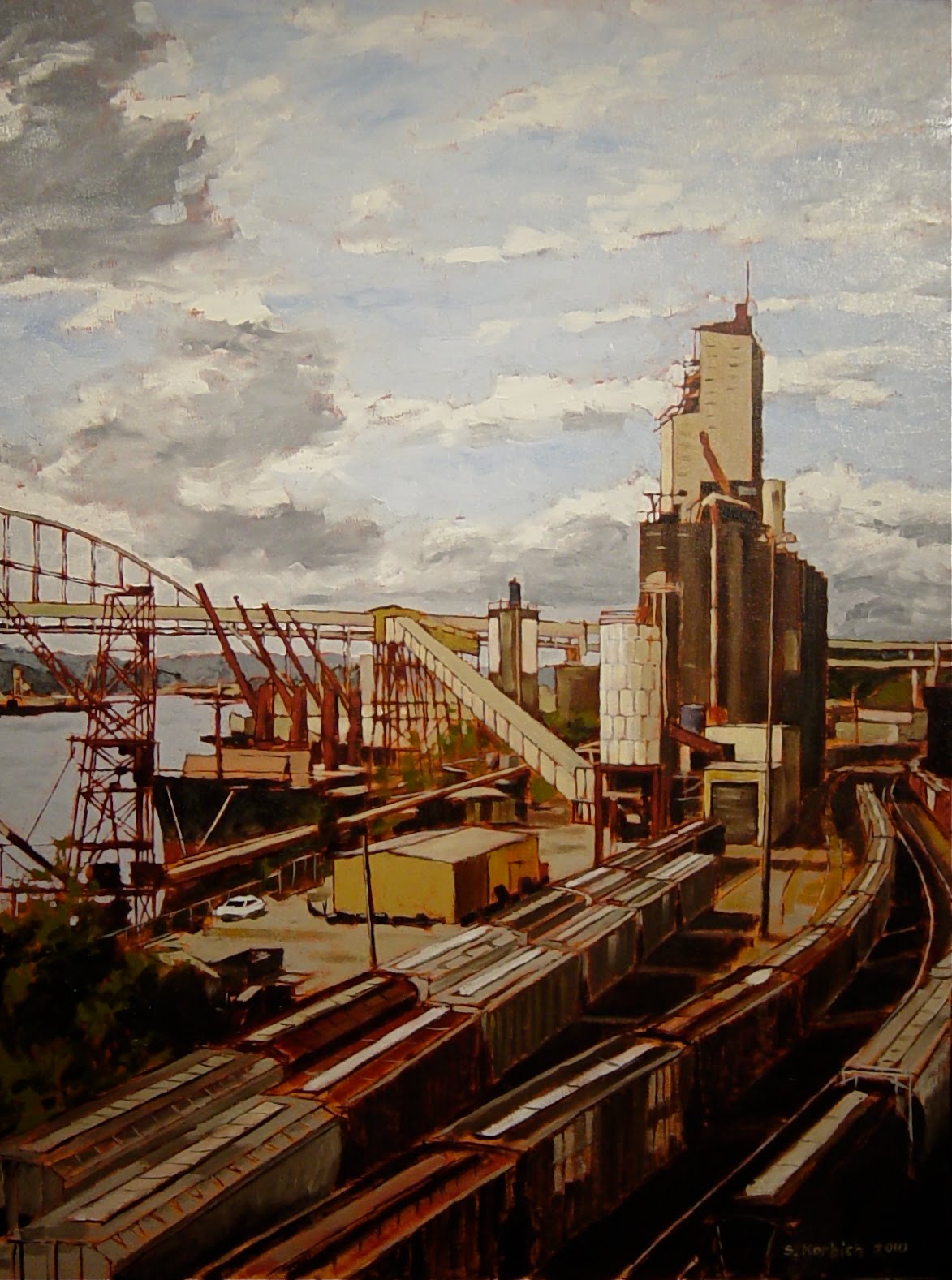
Natasha was drawing with crappy Crayola colored pencils and I couldn't help wanting to get her better media. I dug out some ancient Prismacolor sticks that I think that I purchased back in like 1988 for undergraduate school. I have always wanted an excuse to use them.

I felt absolutely no pressure to do anything and had fun just drawing what was sitting around me or visible out the window. The Prisma sticks have a very nice color depth and I like that they force you to be loose. Unlike pastels, they don't layer very well, especially on a smooth paper and require a little bit more upfront thought.

I love the color intensity of these little guys and could see them as larger paintings. I hope to do more with my daughter in the future.

Monday, December 6, 2010

They were framed

I made some frames this past weekend for my Christmas gift series.
I took me about three hours to make five little frame, including set up and clean up. The frames still need some clear finish.
They are made of 1" x 3" and 1/8" x 1 1/2" hemlock trim from Home Depot.
I use a power miter saw to cut them, a biscuit cutter to join the mitered pieces and a brad nail gun, attached to a small compressor to fasten the edge pieces. I use wood glue on all connecting edges.
Any time I need to turn my garage into a wood shop, I need to make sure that I am making a few things as it takes me an extra 30-45 minutes to set up and clean up.
The painting shown in one of the frames was done by my daughter Natasha and I had some extra wood so I thought that I would make her a frame for it.

Sunday, November 28, 2010

Happy Thanksgiving

I was able to crank out these paintings this past holiday weekend. My idea is to give these to my relatives for Christmas and think that these will be good and dry to ship my mid December.
I was digging through my wood pile and need to figure something out for the frames.
The main reason is to share something with my family who have been so supportive over the years. I love them and wish I could afford to buy them nice gifts or take them on trips to Hawaii. Alas, I am quite broke these days and so the second main reason that I am making the paintings is that they are inexpensive for me to create.
These are all smaller paintings, done on scrap MDF board. The rectangular ones are 7" x 9" and the square are 10" x 10".
I have been using a tripod to photograph my work and have been having better results with the same camera. This is good because I don't think that I will be able to afford a new camera any time soon.
It is funny, I am feeling like a starving artist, especially with Christmas coming. I may have to start using paintings as currency, or as trade for services. Do you think that the City of Portland will take a painting as payment for my out-of-control (what is it like $4500 this year!) property tax?


Children Have the Stuff

I seriously don't know. My daughter is showing some talent in the art area and I will encourage her, but I am torn.
I set her up with some acrylic paints the other day and she jammed out some paintings.


Natasha has a nice balance going on in her paintings.


She killed me with this one. I am really getting inspired by her.

Saturday, November 20, 2010

Ahhh, more room

So, I am still painting in my basement, but I now have a little more room.
I had been working out here next to my painting set-up and it was always crowded.
The washing machines used to be right at my back and when we did laundry, I was in the way.
I think it was a blessing in disguise when my seven year old elliptical trainer broke. Initially, I was determined to fix the thing, even thinking that I could weld it. I struggled with the machine for a while, but could not even get at the broken steel tube that had broken and decided that enough was enough (I had just welded another piece on it about two months ago).
I sat there, defeated and decided that it would be a good time to get the exercise routine out of the basement. As it turned out, a gym membership is cheap at a place down the street from my office
downtown and I had been thinking that I would like to get back to a
gym.
I think that this will be a good change.

I worked down in my "new" studio today and was happy with the set up. I still need to work on my lighting, but having more space to stand back and look at the painting from a distance is good.

The blue painting is just the start of a fourth painting in my holiday gift collection. The color of the background is quite the opposite of the brick color of the wall and it will be cool to see how it works out. Again, the perspective on these is very important so I did take a lot of time to lay out the scene.
The photo that I am working from has a tree top in the lower right hand of the scene as well as some rainbow flags. I decided to not paint these in.
Jen says the flags represent the gay folks and this is one of the gay districts of Portland
. I am certainly not excluding the flags from the scene for any anti-gay reason, only aesthetic reasons.


Monday, November 15, 2010

Paint Faster!

It is going to be a challenge to get these paintings done for Christmas, but I think I can do it.
The FedEx truck is 7 x 9 and the street corner is 10 x 10. It takes a fair amount of time to lay them out, but I wanted to get the proportions correct.
The sign in the street corner painting is off a bit and may need some adjusting.
I should be painting in the evening, but I am so wiped from the day. I can push myself to do it...

Thursday, November 11, 2010

Happiness is a Warm Gun


The AA12 is a fully automatic 12 gauge shotgun that is capable of firing 300 rounds per minute. The weapon is designed so that all of the energy is absorbed by the auto loading mechanism, so there is virtually no recoil. In addition to standard 12 gauge shells, the AA12 is designed to fire explosive rounds.

This post is the most political post that I have made yet. The cartoon that I made represents the stupidity of these kinds of weapons. I am not anti-gun or anti-war or a peace loving tree hugger, but at some point enough is enough. A weapon like this in the wrong hands (what are the right hands?) could unleash deadly havoc on a crowd of innocent people. The weapon is supposedly designed for close range urban combat, where it would have a ridiculous advantage.

I came across this weapon while watching a TV show. The bad guys were smuggling these dangerous weapons into Miami. I was curious if there was such a thing as an automatic shotgun, so I Googled it.

The AA12 came up with a number of videos demonstrating the weapon. I came to the realization that as grown men, we are really just little boys inside who like to blow stuff up.

I am a fan of shoot-em-up video games and have shot actual shotguns and hand guns so I too have this innate curiosity. My son runs around fighting imaginary battles using imaginary weapons of all types and I am both horrified and intrigued by this behavior. As we get older, there is some understanding that these weapons are designed to actually kill real people, not just imaginary evil creatures. What is disturbing about the videos is the child like thrill that the shooters seem to be getting from firing the weapon at unsuspecting plastic canisters. Again, I am not without guilt here as I would probably not turn down the opportunity to shoot-em-up.

Our desire, some say need, to create ever more vicious ways to kill each other is never ending.

To create the cartoon, I traced an actual soldier firing the weapon and then created another overlay that made the soldier into a clown shooting a bubble gun. I then scanned these sketches into the computer and added color and texture in Photoshop. The result is what you see.

Saturday, November 6, 2010

The Dark Tower Returns


I can't seem to get enough of this water tower. I have painted it for the third time now and I still find it interesting.
The opposite side of the tank has been tagged by some obsessed water tower tagger, which is unfortunate. The dark tank appeals to me as a simple form and the way it is placed on the roof top.
It is funny that these utilitarian objects take on such prominence in the skyline.
This tower reminds me of some kind of silent robot, waiting for it's time to unleash terror on the city below.

Anyway, I am starting a series of small paintings (the one above is 7" x 9"), mainly as Christmas presents for my family.
They will be painted on MDF panels, which I salvaged from home projects.

Sunday, October 10, 2010

Cable Towers

Here is the finished painting of the cable car towers.
The most trouble that I seemed to have with it is getting my signature to look right, which it still doesn't.
I have been concerned that my John Hancock looks a little sloppy and may need to invest in a very small brush. Some say that an artist should sign on the wet painting, which is difficult to do. I sure looks to me like others paint a signature onto dry paint.
It felt good to work on this. It was a rainy Sunday morning and it was great
to just listen to music, paint and daydream.


Thursday, October 7, 2010

William Wray

I can across William Wray's work in a comic book store of all places. This is probably because he worked (works?) in the comic/cartoon industry.
He has a style that I really admire and I get inspiration from his work.
William works in oil paint and has a great loose technique, augmenting a potentially banal scene with color and light.
Check out his blog to learn more...
http://williamwray.blogspot.com

This cityscape has a wonderfully dark feel to it. To me, it looks like a labyrinth's edge, or a fortress wall. Beyond is a bridge to something light. The glow of the refelected low sun in the valley of the street adds incredible depth to this piece.


William lives in Southern California and much of his artwork uses imagery from the gritty urban landscapes around him.
Here, he embelishes a funky old carport and uses power poles and yellow curb to frame the scene. I like that he is not afraid to work the dark, shady areas and takes vantage points where he is looking towards the light source . Notice the detail of the car at the left side, with it's red tail lights. Cool.

Monday, October 4, 2010

Marysville Paintings on Display


I finally got the Marysville paintings up on display at a local cafe.
The Eclectic Kitchen (4936 NE Fremont) was nice enough to allow me to nail up the five paintings.
Please stop but, have a coffee and one of their tasty pastries and have a look at the art.
The space is great for displaying art and the lighting is very good. This will be a nice home for these paintings for a few months.

http://www.eclectickitchenpdx.com/

Sunday, October 3, 2010

Basics

After finishing the Morrison Bridge painting, I decided that I needed to simplify what I am doing. The Marysville paintings have a quality of light and subject that are working for me. I am interested in the bits an pieces of urban life. These are the places and things that we miss while going about our busy lives.
I am interested in the layering that is happening here. The power cables are an interesting middle ground, which make for a framework for the rest of the image.
The sense of solid and void, light and dark are compelling. We will see if this works in the final run, but I am feeling good about it.
My hope is to create paintings that someone can recognize but also see as an abstract composition.
I was thinking about doing a large version of this, but wanted to start something.

child art


It is great to watch children make art. They are so loose with the way they express themselves and it can be very refreshing to see what they come up with.
Here, Aidan and Natasha draw with chalk on our old concrete driveway walls. They have very different "styles" if you could call it that. Natasha was doing a dance of some kind, swinging the chalk in her hand and grazing the wall with short strokes, making the line drawing that you see. It has an abstract impressionism vibe. She used at least three different colors and seemed vary deliberate as to where she marked the concrete canvas.
Aidan's drawing has a cave painting, primitive feel to it. He is trying to show movement of the characters along the curve. As you can see, he wanted to make sure that everyone knows that this was his handiwork.
We took them to the art museum this afternoon. Aidan is always saying that art is boring or he will say "I could make that" while looking at some of the drawings. "You should do that then" I said to him. Natasha, on the other hand, seems to enjoy the museum.
I envy both their ability to work quickly and not over-think what they are making. They inspire me.

Wednesday, September 15, 2010

Hudson Valley School

The Hudson Valley School was a bunch of 19th century american artists who were in to sublime landscapes.

We have all seen these kinds of paintings in art museums and they are impressive.

In my previous post about the Morrison bridge painting, I was musing about the feel of the painting and how it felt old.
While I can't hold a candle to someone like Samuel Coleman's "Rainbow" painting shown here, I am thinking that the Morrison bridge painting has some similarities.

Try replacing the rainbow with the bridge in your mind.

Monday, September 13, 2010

Morrison


OK, I'm looking at the image of my painting above and am thinking that it looks like an early American landscape painting. Is that a good thing? It does not seem like a bad thing.
It certainly does not suck.
I would really like to be able to loosen up more.
Anyway...it is good (my wife said it was "good", which usually means that there is something that is bugging her about it)
I do like how the painting can out. The stretched out view shows the entire bridge span as well as the rivers edge. The sense of light is pretty good as it was on my way home from work at about 5:00 PM in the fall. Those clouds were really ominous looking and I thin that I captured the power of the sky here.
Reflections continue to be a challenge, but I did well here. I held back on too much detail on the water, which is good. One could paint ripples and waves forever...no thanks.
This 12 inch by 48 inch painting is for sale. Please buy it. It will look great over your sofa or flat screen TV. I am thinking $600 with a black hand crafted frame if you are interested. As usual, my photo does not do the painting justice, so please come see it in person.
Seriously, I need some cash for a better digital camera and to buy Mickey Mouse ears for my kids when we go to Disney Land in October. The only reason that we are going to Disney Land is that my wife has a fantastically generous sister who wants to get a picture with the kids and Mickey.

Sunday, September 12, 2010

Painting Gear

A lot of people ask me about my technique. They seem to be impressed that I use oil paints and consider them to be difficult and messy to work with.
They also consider them to be smelly.
Ok, oil paints can be all of these things, but are not necessarily any worse than acrylics.

Brushes:

I use what are called "Brights" which have a straight, flat bristle. I rarely use any rounds or beveled brushes. The brights can be used to make thick or thin strokes.
The smaller four here are what I generally use to do my painting, with the larger one being used for prepping backgrounds.
I don't have a favorite brand per say, I usually look for a good brush that is on sale.
I like the synthetics vs. the horse hair brushes because fo their uniformity and soft feel.


Paint:

I use walnut oil based paints by M. Gharam exclusively. My palette is currently what you see below.
Titanium White
Transparent Iron Ixide, dark and light
Van Dyke Brown
Yellow Ochre
Cerulean Blue
Ultramarine Violet
Ultramarine Blue
Cadmium Red, Light
Quinacridone Red
Olive Green
Cadmium Yellow


Solvents:

These are the things that have more toxic vapors. Thinners are used to make paints more runny and for cleaning brushes. I use a low odor type of mineral spirit, which helps make it easier to live with.
Medium is used to make the paint more fluid and hastens the drying time. This has an alkyd that is kind of nasty. I usually mix a little of the medium with my paint as I mix on the palette using the squeeze bottle you see here.
I keep a little walnut oil to use as a thinner as well. You could use the oil almost exclusively as a medium and to clean things. This would make it much less toxic.

I must stress that even though there are these so called "odorless" thinners, you need to always paint in a well ventilated space. I always have a fan going to move nasty vapors out of the room.
Even still, I need to take a break every hour or so to get some fresh air.
I wish that I could afford to build the studio in my backyard so that I would have more room and better ventilation.


I will have to talk about how I clean my brushes sometime.
Actually, I destroy my brushes, and just happen to run them under water and rub soap into them, which while necessary, seems futile.

Waste:

While taking a painting class I learned that you never have to trash your used thinner. Simply pour the dirty thinner into a mason jar, cover and wait a few days. The solids settle down to the bottom of the jar, leaving virtually clear thinner that you can reuse.
I have a mason jar that I have been using this way for two years now and it is just now getting to the top with sediments.

I have an old board that I wipe all my unused paint on. (it is always a challenge to waste as little paint as possible). This board must weight five pounds by now and I intend to keep piling on the paint. In contrast to acrylic paints, which "clean up" with water, there is little waste added to the water system.

I try to use old underwear and socks for rags. Old under shirts are the best. Once they are nice and dirty, I do need to dispose of them inthe trash. I probably use my rags for vehicle and household projects than I do for painting, which is sad.

I'm going to go out on a limb and say that oil painting is the greener alternative.

Tuesday, August 31, 2010

Morrison Bridge Begins

This is a long painting of the Morrison Bridge here in Portland.
I really like some of the panoramic images that I get from my digital, piece of crap, camera.
In fact, the panoramas seem to be the only good quality of the camera.
Anyway, here is an image taken by said camera of the latest start. This underpainting is around four feet long and I got a little carried away with the background base, which is all the swirling orange that you see.
Please think about buying this painting so that maybe I can invest in a good digital camera.

Monday, August 23, 2010

Musing


While I have not done any actual painting in a few weeks, I have been thinking about it.


Finding interesting subjects is actually a big job and takes a lot of time, luck and presistence.


As we get into the late summer and early fall, the sun starts to cast longer shadows. This is my favorite time to taake photos as the contrast is good and the colors warm.


I have been trying to get more scenes with people in them. It is very hard to walk around and snap photos of people and not feel a little creepy, but these are becoming much more interesting subjects to me.


In addition to this scouting around, I have the layout lines on a long canvas set up in my easle for a painting of a bridge. I was very close to starting the underpainting this past weekend, but just did not get in the mood.


Wednesday, August 4, 2010

Obsession and Madness and Making Art

Art is a funny thing. Artists are funny creatures and must be strange in some way to make them want to do what they do.
There seems to be a meeting point between madness and creativity which creates a calm place.
I know that for me, when I am painting, I feel very centered and calm. When I am not painting I think about things too much and am probably borderline obsessive compulsive or ADD at least.

I was reading a blog of an artist that I know. He gets a lot of shit from family and friends about his art and how much time he spends on it. He is very intelectual, or somes off as such and may be more self concious about how people see him.
He is a great photographer in a very austeir kind of way. His drawings are very simple, but are built of many layers and so many lines that you would think it would take a year to do one of his large drawings.
His work is very different from the work that I do, yet I admire the dedication to the art.
From looking at his work, I can't help but think that he is driven by some kind of obsession and that if he did not get his thoughts out in this way, he may slip into some mad state of being.
I would show you his work, but I don't know him that well and I would not want to offend.

This seems to be a common thread amongst most artists. The art is a mediator of the artists madness and emotion not just a pretty (or ugly) object.

I guess that what I am getting at is that the artist must make art or they will wither and die.
Make fun or roll your eyes, but they are doing what they do because the have to.

Sunday, August 1, 2010

Marysville Paintings Done!

Yes, I finally got the last one finished this weekend.
Well, it has to sit for a bit to dry and I need to see if something is bugging me about it, but it is done.
Next I will oil out the last two and add a temporary varnish.
Then I will add the usual wood "frame" and see if I can get them up in a cafe.
I am very happy to have this series on the way out of the studio.
Sweet!

Young Artist

This is a painting that my four year old daughter Natasha made.
It really caught my eye. She did this all by herself with no direction. I think that it has nice balance and color.
I think that Natasha has a natural talent and hope to help foster her art.
She has taken to drawing and painting more so than my son and has much more patience for it, which is key.
She call it, "Flower Garden"

Monday, July 26, 2010

Last Night

In a whiskey fueled session last night, I made some progress on the final painting in the Marysville series. The blue green adn violet colors make me think of comic books from the 1980's. I like the way the colors are working here.
The reflections are working pretty well.
I was surprised how long it was taking me to paint this one. There is quite a bit of detail here, even though it looks relatively simple. I was working at night and was probably more tired than usual, which may have made the time it feel longer than it was.
The tree highlight, sky and stuff through the windows is next and probably should be the last of it. I need to wait a week to let this layer dry.
Oh, how I want to be done with this series! Almost there...

Fine tuned

I was looking at this one for a while. The lack of shadows makes it difficult to give depth.
The back of the electrical panel box can been seen in the images that I was using for reference.
The wires are darker in reality. Reality was not cutting it for me.


This weekend I wne t back and darkened (almost black) the panel box and lightend the switch panel. This does give more depth to the painting. This is an example where I needed to take some artistic license.
While this is still a different sort of subject, and perhaps a misfit, I think it portrays a kind of dark quality, which contrasts with some of the other paintings in the series and can add some balance. We will see how it plays in front of a crowd.


Monday, July 19, 2010

Sketchbook

There is a great roof top patio at the building where I have my day job. It is a great place to clear the mind.
I have many sketch books from over the years. I have never been as anal as some architects in keeping a sketchbook, but do like to put down some thoughts.
The sketches above represent a 20 minute coffee break on the roof.

The progress on the Marysville series is dragging on too long. I need to get them finished. Stay tuned.

Tuesday, July 6, 2010

Marysville 5 Starts

My painting sessions on the weekend tend to start fairly mellow but end in a frenzy. I usually realize that I have been painting for hours and that the kids are freaking out as is my lovely wife, who has been dealing with the kids.

I was feeling kind of woozy after this session. It was probably the combination of thinner fumes and low energy.

There was a lot of layout involved with this painting because getting the perspective tight was critical. The reflections were a challenge as well. I did the layout with a light pencil, the underpainting with my usual gray mix and white. I have spent six to eight hours on this to get it to this point.

Friday, July 2, 2010

More Marysville 4


Hmmm, I like it, I don't like it, I like it...
I think that this gets the idea across for what I was hoping for. Or not.
It is kind of flat don't you think?
The lack of shadows does not help the flatness. A shadow line in the box would help.
The light switch is my favorite part, which is funny.
I set out to finish the thing last night and I did. So there.
This one can sit while I finish the last Marysville scene.

Tuesday, June 22, 2010

Grinding Away

The latest Marysville painting has been a good challenge.
I am having trouble figuring out how to paint the wires in the scene.
The first image is shows the overall progress.

This next one shows wehre I got into trouble.
The wet in wet technique is when you add paint to wet paint already on the painting.
It can be a great blending technique for different things.
However, the danager is a muddy mess like you see below.


After I botched the top half, I changed my thinking, knowing that I would have to come back again and work on it after it had dried.


Patience is the key sometimes...

Thursday, June 17, 2010

Marysville 4 Under-painting

I keep wanting to get the Maarysville Series Finished.
While the need to finish is looming, I don't feel any less excited about the paintings.
Each one has it's own little story to tell.
This one, of a junction box has a mystery to it. To me the image says something about the complexity of things that lie beneath the skin. It is a deconstruction of sorts.
The majority of the painting will be grays and pay yellow browns, but the wires around the switch panel will be many colors. I hope to exagerate the subtle color that I see in the existing images.
While there is a story here, I also hope the painting has a graphic, patterened quality, with the potential for abstration and random geometries.
Or, it's just a grungy, funky painting of a messed up electrical panel, which would be ok too.

Number 5 is under construction and is in the pencil stage right now, so there is hope that I will finish the series within a month.

Friday, June 11, 2010

Portland Artists That I Like

First, let me say that I appreciate that Google has offered me this free blog space.
Second, the editor that is supplied with the blog is a pain.

Anyway, beggers can't be choosers, so here are some painters I like.


Melinda Hannigan


Robin Siegl


Henk Pander


Roll Hardy


Micheal Brophy


Jolyn Fry

Monday, June 7, 2010

Working on Working River II

I had some time this weekend to add the sky. The painting has come together as I had hoped.
It is interesting to notice how my palette is becoming consistent from one painting to the next.
This painting is at the stage where it could be done, but I want some time to think about it.
My fear is to not have done enough but at the same time not wanting to over-work the thing.
I feel good about where this painting is at and it may very well be complete.
I purchased some old wood at the Rebuilding Center and will make a frame this weekend.

Tuesday, June 1, 2010

Little bits of something big


Here are some teasers of the current project
I think there is good texture here. The colors are close and the sky is really going to pull things together! I will let this dry for a few days and hit it again.