My First Art Opening

The painting continues...time is moving quickly these days...


Monday, December 14, 2009

Street Light

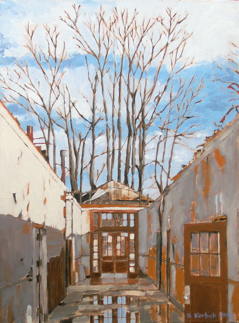
This is finished version of a painting that I started. I just completed it this weekend and may do some more work on it, but then again...I like the quiet feel of the thing.
The color is very sepia toned and the orange foliage pops pretty well. As I look at the small image here, it looks fairly realistic. If you click the image and get a closer look you will see the more painterly bits (as usual, I still don't have the ability to get the photo to work, which may be a good thing. Please see the real thing).
Overall, the painting does what I wanted it to do.

Sunday, December 6, 2009

Street Light

In the winter we don't get a lot of sun. When it does come out it is good to get out and absorb as much as you can. You have to become a kind of sun camel to live here.
This is a quite moment and the light was just beaming through the trees. I like the graphic quality of the trees and the one point perspective is always nice. Getting down on the street is a nice change and this is the first of four that are more down to earth.

Better Burnside

This is the updated Burnside Bridge painting that I showed before. I think that it is better. I added more yellow to the sky and water color, which makes it a little less pink. The sky really was more of a light red amber which I think I got close to.
I used a straight edge to do the reflections which is more how the reflections look across water.
I also darkened the bridge piers to give more contrast.


Saturday, November 28, 2009


This is a photograph by Frank Breuer who worked with and was influenced by Hilla and Bernd Becher. I am not the only one who finds these types of subjects interesting.


Burnside Bridge Almost

So, here is a painting that I wanted to be done, but it probably needs some additional work.
The general detail and color are good, but I don't like the reflections in the water so much and the bridge needs to be a bit darker.
Once it dries, I will hit it again if I have time.

Tuesday, November 24, 2009

Dark Tower Returns

I completed this painting this past weekend. The composition is pretty good and, to me, it is a bit cheaky in the way the fire hydrant seems to be facing off against the water tower. The shadows around the hydrant add interest (I believe the cross shape is from a church).
The sky came out well and overall, I think I added the right amount of color to the more gray areas. In reality, the pavement and concrete is more warm, but I wanted more contrast with the warm hues of the warehouse and the hydrant. This is 18" x 24".

Thursday, November 19, 2009

Morning Joe

I did this small painting a year or so ago but was really enjoying my coffee this morning so I thought that I would drag it out. This is actually the first small painting that I tried.
I am a morning person and the right dose of coffee gets me in the best mood. Too much coffee can make me shaky, which has its advantages in art, but is usually not an advantage.
Good to the last brush?

Sunday, November 15, 2009

Happy Yellow Streetcar


I like this one a lot. I wanted to do something with some bright color and this scene seemed like a good choice. It is one of the larger ones at 30" x40" and I have been loving looking at it. It will be tough to see go, but I hope to sell it at some point.
The part I am having trouble with is the dark area at the center left. The oil paint is predictable in it's color, but the sheen can change quite a bit as it dries. When the paint gets dull it is referred to as having "sunk". This is especially noticeable up close. I need to do a little research and see if I can get the shine back to these areas.
I think I did a good job with all the reflections on the street car. I was curious if I would be able to make the glass feel like glass but was pleased with the result. I debated whether or not to put in the sun highlight (the white shine at the upper left of the car) but am glad that I did as it adds to the realism.
It was a very busy weekend and I have to thank my wife (she gave me the whole weekend to paint!) and kids for putting up with me. I must have put in at least twelve hours Saturday and Sunday.
I was able to finish this large painting and start two smaller paintings.

New Starts

These are the latest under-paintings.


This is another view of a water tower that I had previously painted. I like the quirky composition and the long shadows. The focus is the water tower and the hydrant plays a supporting role. I find the shadow of the church steeple in the foreground to be kind of ominous and interesting.
This is a relatively simple scene compared to others that I have done, but the perspective was a challenge.
In fact, since I first posted this, I have retouched the windows on the building to make the perspective more correct. Repetitive windows on a facade are easy for me to draw as flat elevations with the T square, but in perspective it takes some finesse. I have drawn perspectives so many times that you might think that I can get the thing down the first try. Sometimes that is the case, but usually I need to go back and correct things.

The Burnside Bridge in Portland is not as dramatic as some of the others, but in this end of the day scene it is lovely. It is tempting to make the under-painting look like it is complete as is and I may do a series of under-paintings as the final work. The yellow water really gives this away as just the understudy. The sky and water will be a luminous yellow-red (peach?) with violets and blues in the bridge and background land. Many points of light will add sparkle to the painting and I will add them at the very end. I want this to have a more impressionistic feel but we will see.

Thursday, November 12, 2009

Raphael up close

This month, the Portland Art Museum has a one painting exhibit by the famous Renaissance artist Raphael. The painting is "La Velata" (woman with the veil) and is one of Raphael's most famous portraits. He painted it between 1514 and 1515, which makes the painting almost 500 years old.
The museum has it displayed in an almost tomb like sapce in the second floor gallery at the Southeast corner of the building. Itis a dark space where velvet curtains have been draped. The painting is displayed in perfect light on the West wall of the space, making it the only bright spot in the room. I guess that I was not surprised to see a treasure treated with such reverence.
It was fun to see such an old painting up close. It is in very nice shape, with only slight cracking of the paint and must have been restored fairly recently.
Was I moved? Not really, but it is a beautiful piece to be sure. Did I have great admiration for the piece, absolutely!
I have not seen the Mona Lisa by Da Vinci in person, but I did see an exhibit which had a close replica. The Mona Lisa has a lot more mystery to it and got me going a lot more than La Velata. La Velata has a real calm feel to it and as expertly crafted as it is, it lacks depth as far as I am concerned.
Ha, maybe some wanabe pipsqueek artist will say something like that about one of my paintings.
I can dream can't I?

Monday, November 2, 2009

Matisse


"Matisse's art has an astonishing force and lives by innate right in a paradise world into which Matisse draws all his viewers. He gravitated to the beautiful and produced some of the most powerful beauty ever painted. He was a man of anxious temperament, just as Picasso, who saw him as his only rival, was a man of peasant fears, well concealed. Both artists, in their own fashion, dealt with these disturbances through the sublimation of painting: Picasso destroyed his fear of women in his art, while Matisse coaxed his nervous tension into serenity. He spoke of his art as being like ``a good armchair''-- a ludicrously inept comparison for such a brilliant man-- but his art was a respite, a reprieve, a comfort to him."
A quote from somewhere o0n the internet, apologies to the author who seems to be anonymous. Let me know if you know.

Obviously, brilliant work. He makes it look so easy, but it is not. The subject, composition, color, light, mood, it is all there.
I can imagine the emotions involved in the art of the times of Matisse and Picasso.

Sunday, November 1, 2009

Something a little different

This is the under-painting a new piece that I am just starting. Yes, I am not beyond something cute, and I chose to do this scene of the Portland Street Car. It is a bright yellow car and looks like it has a big smile. Yes, I am not beyond doing something cute. By accident, I gave the trolley a little more tilt to the right, which I think gives it additional energy. The additional tilt was not apparent to me until I had the majority of the under-painting completed. There is a lot of movement in the scene, which is good. The dark background will really help to pop the yellow trolley, which is the obvious focus of the piece.
I have to admit that it is not my first goal to create a realistic image. However, as I look at artwork that I like, even the more abstract pieces have their compositions, perspectives and sense of proportion correct, so this more realistic painting will be good for me.
The reflections on the glass of the trolley will be a good challenge as well. You can see some of the reflections starting to happen in this first stage.

Sunday, October 25, 2009

Back to that abstract


I look at this painting every time I watch TV. I should be painting instead of watching the TV but I am generally too tired in the evening to do any artwork.
This is the third time that I have retouched this painting and it is still not right. Abstract work is very hard I think, but I do want to do more of it.
Hopefully there are some ideas for the cityscapes that will influence abstract stuff for me in the future.

Last Steel Bridge for a While


This painting is 15" by 32" and was a nice way to say adios to painting the Steel Bridge. It was nice to paint the structure in a larger setting, with less detail and more sky and river.
On other paintings, I was tempted to add detail (clouds, brush strokes) to the sky, but I kept this one simple.
The reflections and noise in the river came out well. The warm, rusty background that I used over the white canvas makes a nice golden glow, which was evident in the late afternoon scene. I even let a lot more of the base color show through to try to exaggerate the warmth.
Overall, I think that this one has a good mix of detail and abstraction that I prefer.

Sunday, October 11, 2009

I started this long format painting today. I am hoping to give it to my wife for Christmas.
Because of the awkward format, I need to remind myself to keep stepping back and checking the perspective. This is just the underpainting and has good bones, so I should be ok.
Stay tuned for more.

Monday, October 5, 2009

The Working River #1


Two paintings were picked up by some happy clients this past weekend. One of them asked me if I felt sad letting a painting go? I am only sad in the fact that the project is over, but I like the fact that somebody else is enjoying the painting. If I have a painting sitting around my house then I just scrutinize it, which is educational but a little annoying. This is true for work that I have up around my place.
The same day the two Steel Bridge paintings left, I started in again on what I have been calling "Down by the River". I added more detail on Saturday and finished up on Sunday. I say finished, but need to live with it for a while.
I like that my work is developing a certain look, but keep looking at the work of impressionist artists and do think there is much to learn.
The light is subtle in this painting. The scene was captured early in the morning and the sun is low and is casting very long shadows. As with many of my paintings, I think that I get very close to capturing the light. I have always been shy about contrast in my drawing and painting and need to keep pushing the light and dark balance.
The sky helped with the contrast and I like the colors, but am not convinced by the line between the light red and blue. In reality, whatever that is, there is a much more subtle gradient. The light red (ok, pink) is a fog/cloud bank that typically happens at dawn. I have seen this cloud line be much more abrupt, which is what I am trying to emphasize in this painting. There is a graphic quality to this line, but I will keep looking at it.
Over all, I am pretty happy with this one.

Friday, October 2, 2009

I donated this painting to the AIA (American Institute of Architects) Portland office. It was the least that I could do, since they agreed to waive my membership fee this year due to financial hardship. It can be expensive to be a professional architect. Supposedly they are having an on-line auction, although I can't locate the link.

Monday, September 28, 2009

All work and no play...

I do have a penchant for fantasy and science fiction as well as graphic novels and cartoons. My son and I made up this character named I-Blaster. He (has to be a boy my son says) is a robot who fights renegade robots and either brings them to justice or blows them to bits.
This is part of a poster that I gave him for Christmas.

This is a birthday card that I made for his 7th birthday. He liked it, but not as much as all the Legos that he got. What you gunna do?

The technique involves me sketching the scene in pencil, tracing in ink, scanning the image and adding color in Photoshop. The old-school cartoonists used to have to add the color by either painting it on or laying colored film over the black and white lines. Photo shop makes this kind of thing easy. I would love to do a graphic novel or childrens book some day. We will see.

Friday, September 25, 2009

Steel Bridge Part II

I just put the final touches on this painting last night. I had painted in a fella walking on the tracks, but he was too big (out of scale) and was more distracting than helpful, so I painted him out of the scene. I do think that something may have helped to bring more of a scale to the bridge, but I like the contrast of the structure and the background. I think that at 32" x 44", this is the largest painting that I have done to date.

Here is a little bit of detail. This is where I feel like I am starting to venture into the abstract. While the image is clearly of a bridge, the potential for further abstraction is clear. Oh, so many ideas are popping into my head now! I need to pursue the use of these vignettes to make other paintings.

Wednesday, September 23, 2009

Creative Times

Everyone has their creative energy highs and lows. For me, the mornings are the best time for ideas and for creating. My energy level is high in general and things seem a lot more clear. Once I have that first cup of coffee, I am ready for my mind to open.
I do feel like I waste this energy all too often on trivial things that could be accomplished with less creative energy. I also find that if I don't do something to release this energy, I become agitated and irritated and will end up feeling tired.
I do think that the act of making art and being creative releases important chemicals into my brain. During a painting session I feel lucid, calm and happy. After a long session, I am tired, but feel like I accomplished something and am content. Knowing that I have a project in progress can also make me feel good.
My least creative time is in the evening. I can get some grunt work done like stretching a canvas, adding one block of color, building a frame but it is not a good time for creative thought.
I do get that burst of thought that keeps me awake in the middle of the night. My dreams can give me ideas for different things.
I like to listen to other peoples ideas. Reviewing student work, architectural or other artistic things, can really stimulate my creative side.
If I had to give advice to anyone attempting to draw, paint or design it would be to figure out your creative energy schedule. I would also tell them that if they are stuck on something, to get away from it and come back after they have done something completely different.

Wednesday, September 16, 2009

Inspiration is the bridge

I snapped this photo of the Freemont bridge while I was on my bicycle commute to work this morning. The light was amazing and the water and sky are perfect. I am tempted to paint this scene.
It will have to wait as I have two larger paintings that I am trying to finish and another on deck of the river looking the other direction.
The more I paint, the more I see things everywhere that would make interesting art. The scene can be something as mundane as a trash can or as magnificent as a bridge. I am happy that there will be no shortage of influences in Portland.

Thursday, September 10, 2009

Ugly phase

I have added color to this previously shown painting. The colors here are exaggerated and should make a nice base for the final glazed on color. The sky will be much lighter as well, which should help things pop.

Back to the Steel Bridge

This is a new painting of the Steel bridge. I was not sure about the composition, but I am very excited about the way it is roughing out. I like that the bridge dominates the canvas, and at 32" x 44" it is a big one.
I need to add more detail and block in the background. After this I will put in the sky and water.
The layout on this one did take many hours, but I think that I have things in the right proportion and perspective, which is a relief.
The image that I am working from has some tree leaves in the foreground, but I don't think it needs a foreground. Any thoughts?

Tuesday, August 18, 2009

Down by the River

This is a view looking North from the Broadway bridge in Portland. I see it every morning when I ride my bike to work. There is so much industrial stuff down by the river here that I am overwhelmed with painting possibilities. I liked this scene because of the way the trains really pull the perspective and the grain elevator (I think that is what that is) gives a nice vertical move to the thing. There are a lot of colors here including lots of reds. This underpainting is a good start I think.

Monday, August 17, 2009

Dreaming of a new studio

Working in the basement of my house is practical and costs nothing. It is cramped, I share space with the washer and dryer, work bench, exercise equipment and numerous spiders.
The image above is not my studio, unfortunately. This is an artist studio designed by Le Corbusier for a client. This is how my dream studio would look like. A spacious, double high space with lots of light and a ladder going up to a sleeping mezzanine.
Below is a design for a back yard studio at my house. The idea was to create something that would not require a permit. It is also designed to optimize material use and is something that I could build myself for around $3000. The reality is that my wife and I could both use studio space at the house. I have been thinking that we should double the size of the studio so can both work together.
This may happen sooner than later.

Tuesday, August 11, 2009

Man of Steel

The painting is almost done. This one has been a real challenge and I feel a little beat up by it. What remains is some possible additions of highlights, probably pure titanium white. It is a larger painting, 32 inches by 42" and the painting needs someplace to breath. I will let the beast dry for a week or so and touch it up if I feel like I need to.
I ride my bike across this bridge every day, so I notice things. It is very black, but if you look closely at it there is a lot of color. There are redish rust spots, bird droppings, spray paint, all kinds of stuff. The black seems like a warmer black, which makes it look pinkish in spots.
This is the most macho of the Portland bridges.

The next painting will either be another version of the Steel or an industrial scene which I have been wanting to paint. Stay tuned...

Sunday, August 9, 2009

More Detail

The first Steel Bridge painting is almost done. Color and detail has been added. The image above is just a small part of the whole painting, but represents the level of detail that the whole piece should project. The blue sky, background and water add much needed color to the piece.
My wife gave me a good critique and I should be able to finish the painting in the next session.

Saturday, August 1, 2009

The steel battle


I was a little frightened to start this rather large painting of the Steel Bridge in Portland. There are so many things going on with the structure. The process of doing artwork or design for me is a battle, which is a good thing. I prefer to attack the canvas than be too tentative.
Obviously, there is no realistic way that I can include all the information in the scene, but I can focus on the major elements. A photograph will get all the detail, so take a picture if that is what you want. This is a painting and I think it should look like a painting.
The underpainting, shown above, has a very sketchy look to it and I am happy with the result. I did take a lot of time to get the major lines correct and it feels good.
Before I started the line work, I washed the canvas with red oxide paint, thinned with spirits and then wiped with a rag to give a nice, warm base tone. I chose this color because there are hints of rust in the bridge. The color will show through in spots, even in the sky.
Being and architect and doing a lot of architectural renderings and perspective drawings is probably a big bonus for me doing paintings like this. Actually, I would not have chosen this bridge or scene myself, but someone wanted a painting of the thing. I'm not usually into punishing myself this much. It is turning out to be a great challenge and I am looking forward to when this layer dries so I can attack it again.

Here is some more detail.


Monday, July 20, 2009

Knowing when to put the brush down


It seems like the best paintings are the ones that seem to have gone down easily with just the right amount of paint strokes.
You may here artists and critics talking about a painting that has been "overworked". This is not usually a compliment. This means that too much paint has been applied and it is obvious that the painter struggled. I am still working on staying relaxed and letting the paint go down easy.
Some artists make it look easy because they have the ability to move through the painting quickly and confidently. This comes from many many years of painting.
I feel like this painting went down fairly easy and I kept the brushwork to a minimum.

Broadway Hit

The Broadway bridge in Portland Oregon is perhaps the most recognizable of the portland bridges, probably for it's red, iron oxide paint job.
This 30" x 40" painting is a commissioned work and will hopefully be on it's way to someones living room soon. I just put the final touches on it this weekend and and waiting for it to dry and will then put some re-touch varnish on it for safe keeping untill it has dried enough for a final varnishing.
Once again, the underpainting (first lines and value study on the canvas) is critical. Urbanscapes need attention to the major lines of perspective or things won't look right. I had to go in and adjust some of the bridge structure after I thought that I was finished. It is probable that you will get a lot of paint down and will then notice that you missed the perspective someplace.
This painting has a foreground (red bridge), a middleground (train station) and a background (tall pink building and the rest of the city. I am learning more about how to create the illusion of depth. I had painted all three levels at the same value, but realized that it need more depth. I glazed over the background elements with a little white, which I then wiped with a rag. This gives an atmospheric haze effect which pushes the scene back. The middle ground elements are painted with less detail, but are still the same value as the foreground.

Thursday, July 9, 2009

Broadway in Progress

Here is a small portion of a 30" x 40" painting that I am working on for another commission. I surprise myself with these bits of larger paintings and how they work in their own way.
I forgot to take a photo of the under-painting for this one, oops.
The detail on the bridge structur eis almost done as is the sky. There will be more work to do on the cityscape beyond. The trick there will be to let it have enough detail to create interest, with enough fuzz and atmosphere to enhance the depth of field.

Wednesday, July 8, 2009

Under it all

This is the underpainting for a painting of the St. John's Bridge.
I did a wash of left over color from another painting prior to this days work. Sometimes it can be good when color from the underpainting shows through.
Once the wash dries, I made a 4 x 4 grid in pencil on the canvas an a matching grid on the much smaller photo that I am working from. This lets me transfer the geometry in a more accurate way.
In this case, I used a hard charcoal pencil to sketch in the geometry and then used a mixture of dark blue, brown and iron oxide to create a tonal study.

Sunday, July 5, 2009

Saved One

Most paintings have an ugly phase, which is just part of the process. I'm sure this is what scares many people off from painting and is almost as bad as the blank canvas. The painting above was in a state of ugly that stumped me for a while. It was sitting in my basement studio in plain sight. I left it there to torment me and force me to, at some point, finish it.
I finally got into it again this weekend and finished it up. While it isn't the best, I think it is out of it's ugly phase.
The refurbishment of the old Pioneer Courthouse cupola intrigued me because they had this white covering over the facade while they did the work.
One of the things that was troubling me was the building in the background. At first, I painted building with all the windows. It stole attention from the cupola, so I decided to paint over it. Bits of the background building can be seen in the painting, which is just enough to give a context to the courthouse roof.
The light in the scene is from an early morning sun. The contrast is subtle and the painting could have been helped by darker shadows. Contrast is important in paintings and it is something I look for in subject matter, but don't always get.

Wednesday, June 10, 2009

More Sky


So I added more texture and color to the sky of the "Lost Tracks" painting. The two bright spots at the top are from my lighting in the studio. The paint is very wet and is reflecting a lot of light, plus my studio lighting set-up is not great.
I think that the new color and texture helps to enhance the perspective and helps to unify the look of the painting. Getting the brush strokes to move through the power lines is tough and is something that I will need to work on. Still, not too bad.
I continue to work on my photography of the work. The previous image in t his post was taken in my basement with two 100 watt lamps, but the color was wrong and there was a lot of glare at the top of the painting.
The image above is a repost and was taken outside with the previous camera. The color is good and the light is ok. It is best to see them in person, of course.


Tuesday, June 9, 2009

Loosen up

The following three pieces are still wet. With these, I hope to get a showing at a local cafe or eatery and put them up for sale.

This 24" x 24" industrial scene goes back to what I started last summer. I like the Industrial landscapes for their chaotic geometries and unpredictable color and light. This vista was an image that I had filed away, but rediscovered. It is probably my favorite painting so far, and my latest. I may do some retouching of the sky, but I want it to sit for a while.
I used a canvas from a previous abstract that I was not happy with. Traces of the older painting can be found if one looks closely. You won't see it in this image, but traces are there.
I tried very hard to keep loose and let the brush strokes show with this one. I exaggerated the colors to give a colorful spirit to the painting. This feels like a turning point for me.


The following two paintings are small 8" x 10" paintings. Sometimes, I find the backs of buildings to be more interesting than the front.
Again, I tried to stay loose. In the water tower painting (the last image below), I left some of the iron oxide under painting to show through. This gives a nice layering, which I need to do more of.


Friday, May 22, 2009

Sketching outside


Here is a pencil sketch of a food cart at Portland Staste University. This was an absolutely fantastic day to draw outside. I used an Eagle 314 pencil and spent only about thirty minutes on this.
I was hoping to do a sketch a day, but that is not happening. I will try to do more.

Art as decoration


This is a 3D Studio (computer) rendering showing a 8' x 12' sculptural painting for an office building lobby. We sometimes design big walls for art only to find that the client does not necessarily want to spend $20,000 for a large art piece to put there. It seems like there is an opportunity to make art for these kinds of spaces without breaking the bank. I came up with this concept of different size canvases with superimposed geometry. I feel like I could do it for $3000 and make a profit. Artists and gallery owners who sell large scale work will probably frown on this kind of thing, but maybe there is some room for me to get in the door. It can't hurt to try to use my architectural connections to sell my art.
To make this image, I used an existing model of the space. The idea for the piece was sketched on yellow tracing paper and scanned into the computer. I made 3d objects of the canvases in the 3d program and added the image of the sketch on top, which is called mapping. While the sketch was done with colored pencil, it approximates the look of a hand painted image.
How do I feel about art as decoration? Art is decoration for most people, on the surface anyway. The fact that they want to spend their hard earned cash on a custom piece says something and if they want it to match their sofa...so what.
It would be nice if there were more of a dialogue between the architect and the artist. Having an artist make a piece for a space makes a lot of sense to me and seems to make it less of decoration and more of an intervention. It has more meaning perhaps with respect to the architecture.

Monday, May 18, 2009

Still Wet Portland


I just finished this 11 x 14 painting of the Portland Tribune building. It is the back of the building and It is the view that I see from the parking garage where I park my motorcycle. I like the building massing and the way the morning light hits the walls.
I am trying to get more color variation in larger planes in the scene. As I study other painters work it is clear to me that successful paintings pull more and more color out of both bright and dark areas, which can make a simple scene much more dynamic. A photo of the subject may not even reveal these colors and the need to be interpolated or fabricated. Either way it makes for a much more interesting piece.
Exaggeration of color is very important in the city scenes, which can tend to be more grey in reality.
The mind will perceive the colors when one is viewing the subject in person, which is the benefit of on site work. When working from photos, which I am forced to do, one must remember the subtle colors and or fabricate them.

Sunday, May 10, 2009

The following set of four 18" x24" paintings are for sale.
I hope to get them up in a coffee shop in Portland and sell them for $150 to $200.
Most cafes that want to hang your work seem to want at least eight paintings, so I am working on a few more.
I think these are good explorations, but not where I ultimately want to be with the work.  If I want to sell these, I probably shouldn't admit this.
I am learning a lot from each painting that I create, which is a good thing.
The two foggy paintings are very subdued and cold and don't have the depth or color that I was seeing in the real scene.  There are bits that work for me, such as the glazing that is starting to happen.   Still, I need to work harder at creating depth and color in these (see Monet in London for his foggy work).
The "cranes" I like, but the perspective is a bit off and there is no energy.   It is an interesting moment in Portland's landscape.
My favorite is the "sunrise".  I like the colors and the different geometries in the scene.  The contrast is good.  I think that the view of Mt. Hood and the city are fighting for attention, which I'm not sure is a good thing.
The next paintings after these will attempt to focus more closely on urban scenes and I hope to start bringing the human figure into the work.


Portland Fog I


Portland Fog II


Building Portland


Portland Sunrise over Mt. Hood