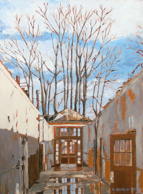
 The first Steel Bridge painting is almost done. Color and detail has been added. The image above is just a small part of the whole painting, but represents the level of detail that the whole piece should project. The blue sky, background and water add much needed color to the piece.
My wife gave me a good critique and I should be able to finish the painting in the next session.

The detail you show of the Steel Br. is a nice little composition in itself. The sky is handled quite nicely. What blue are you using to mix the sky color? Looks like this bridge subject matter demands substantial layout and detail in the underpainting to set up the looser handling in the finish. Your "attacking" metaphor has helped me be more assertive in my own work. (I'm still learning about blogs so will "sign" with my whole name)
ReplyDeleteDave Shelman
Hi Dave,
ReplyDeleteThe sky mix is ultramarine blue, cerulean blue and titanium white.
The red that can be seen in spots is the base color of iron oxide.
The layout is key for bridge painting. I probably spent five or six hours doing the layout using a reference grid. Because of the size of these paintings, I need reference points.
I agree about the detail being nice in itself. This is something that I am finding a lot in these larger paintings. At some point, I need to go back and paint these little bits.
Thanks for the words.