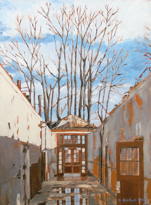
My First Art Opening

The painting continues...time is moving quickly these days...


Friday, November 2, 2012

Some Plein Air Painting


Imagine three grown men standing under the Marquam bridge overpass, in the wind and rain, with their easles out trying to paint.
This was my first time painting outside in a long time. 
What is funny is that these guys had all summer to do this and they finally went out on one of the first bad days of fall.
This painting is much looser than I usually do. 
I may have to try this again when the weather gets better...

F.Y.I.  I did not know what plein air painting meant until fairly recently.  It is French, of course, and just refers to something done outside.  They could call it "Outside Painting" but "Plein Air Painting" is fancy and we need to be fancy.

More Alley Paintings


The shadows cast by the power lines is interesting to me.  Maybe that is all I have to say about that.


This is the largest of the four Missippippi alley paintings (4 ft x 4 ft).  The red wall creates a tension in the painting which I am not sure that I intended.

Lebbeus Woods - Death


Lebbeus Woods died this past Tuesday.  Here is a link to a NY Times web article:

http://www.nytimes.com/2012/11/01/arts/lebbeus-woods-unconventional-architect-dies-at-72.html?_r=0

I have been intrigued with Lebbeus Woods and his complex design and artwork for years.  It was in grad school that I first learned of his work.  I had been following his blog, which he had recently taken a permanent break from.  I wondered what he was dealing with.
While Lebbeus had only a few built works (his art installations the exception) he had a big influence on the architectural underground. 
His drawings are futuristic, post apocalyptic, but also beautiful and well crafted.  He challenged ideas of war, natural disasters, poverty and human survival.
His blog reminisced about his past work, but always provoked a current discussion about architecture and art. 

Here is a link to his website:
http://lebbeuswoods.net/

I like that he was a sort of architectural vigilante who would use architecture as a way challenge conventional thinking about world issues.  His work was often dark, but also optimistic and inspiring.
He was a very unique voice in a cacophony of architectural rhetoric and I will miss him.

Rest Well Lebbeus...

Sunday, September 30, 2012

Alley 2

Here is the completed second painting for the Mississippi Alley series.
I had a hell of a time with the green and ended up throwing out a quarter cup of paint.
You may notice that I highlighted some of the leaf edges.  I did this because it need to pop a little more.  I don't usually like to do that, but I think that it helps this painting a lot.
This is a 36" x36" painting.
It will be interesting to see how the subject matter goes over with people.
This is really just a weed, but I like the complementary colors and think there is a kind of determined beauty here.

Saturday, September 22, 2012

Alley Series

This is the first of four paintings inspired by an alley just West of Mississippi Ave.

Till Death

Introducing the happy couple.

Wednesday, September 19, 2012

Dressed to Kill 2

I don't think this guy is coming back.
I discovered that blue painters tape will stick to 110 lb.
cold press, so I won't be doing that anymore.
I purchased some spray fixative to protect the charcoal.  This one is especially susceptible to smudging.

Tuesday, September 18, 2012

Dressed to Kill

Some Craigslist post was requesting artists to draw zombies.  I never submitted this, but I was intrigued with the idea.  I then thought it would be fun to take images of good looking men in suits and make them zombies.  This guy is obviously not too far into the zombie thing and he still looks pretty good.  Maybe he is a zombie who can be saved...
I used a 3H pencil for the layout and then a hard HB charcoal pencil for the final line work.  No smudging on this.  The idea is to come up with a drawing style that I can use for a graphic novel.

After looking at this sketch for a few days, I am thinking that this is how I have been feeling as of late.  I can't convince my kids that he is a zombie.  They think that it looks like a guy who has been beat up pretty bad.  Indeed.

Friday, September 14, 2012

Alley Painting Starts

I was wandering around an alley just West of Mississippi Ave and got some ideas for pieces.
Here are the starts.  I used iron oxide and yellow ochre for the rusty base color (it looks like I spilled spaghetti  sauce on them, but whatever).  Then I used my usual dark mix for the sketch and added white in some spots to identify highlights.
Painting big is much more exciting for me, allowing for bigger gestures and less small brush work.
The paintings at the right and left are of interest to me.  My gut tells me that there is potential in these somewhat ambiguous images but we will see if anyone wants to buy them.
Not shown here is a 48" x 48" monster canvas that will have a big alley street scape!

Small Paintings

I have to admit that doing these small paintings is not my favorite thing.  They seem to take more time than I want and I find that I don't like working small as much as I like working big.  I also can't sell them for as much as the big paintings.

I really procrastinated working on these, but managed to get myself motivated enough to finish these four little guys.

This first 6" x 6" is on a wood panel and is my favorite.  I was working from a photo and had to take liberties to get the scene right.  I removed some blue mats (not sure what they were) and a few of the tomato plants at the right to show more of the tree and have less clutter.  The focus flows between the yard debris container, the bucket and the tree, which is good.  The sense of the late afternoon light is what I wanted it to be.

This next one is an 8" x 8" on canvas.  This is one where the photo is perhaps better that the original.  It verges on being too dark, but works.
 You see these blue bins all over the place.  This 6" x 6" is my second favorite or is tied with the first one above.  The balance of light and dark is just right I think.  I almost removed the white waste basket at the lower left, but like that it seems to be having a dialogue with the recycling bid.
 The last one is an 8" x 8" on canvas and my daughter said that it would be funny if there was a dog peeing on the fire hydrant.

Monday, July 30, 2012

Graffiti, Is it Art?


I thought that I heard someone outside on Thursday night last week.  I also thought that I heard the rattle of a spray can, but when I went to look outside nobody was there.
The next morning, I found this on the street in the middle of the intersection.
They could have tagged the buildings near by, but they chose the middle of the street.
It is an interesting compliment to the "legal" marks around the man hole.
I was going to notify the police, but since there wasn't anything offensive about the image and it was not an obvious "tag" I let it slide.
What does it mean?  I don't know.  Is it art?  I think so.
I would have tried to engage the manhole more if I had been the artist.


More Industrial Stuff

This is the finished Clearwater Trail scene at the Ross Island Sand and Gravel Plant.
It was fun to paint but did take a while because of all the stuff.
I keep looking at my work and wonder if I should be covering the line work more, but I like the graphic quality of it.  The subject matter lends itself to this technique as well.
The sky was kept simple, although I did think about adding some clouds.  I exaggerated the light blue "haze" to help focus the eye.  In the real scene the sky is a fairly constant gradation.

Sunday, July 15, 2012

Ross Island Sand and Gravel and the Springwater Cooridor

Here is a start on a 3' x 3' painting of the Ross Island Sand and Gravel plant, which is just north of the Ross Island bridge.
The plant is a vertical structure that, I think, balances the composition.  

The detail below shows the line work.  It is easy to get overwhelmed with all the bits of stuff, so I try to draw the major elements with a pencil and then paint in the rest of the detail as I go.  It is best to step back and squint a lot to get just the essence of the details.


As I was scouting this scene, there was an angry voice coming from across the tracks, up on the back.  I can't remember what he said exactly, but it was something like "What are you doing?!".  I could not see him, so I imagine him to be a troll living under the bridge.


Friday, July 6, 2012

Industrial Scene

Here is the completed painting of the scene down under the Freemont bridge on the NE side of the river.  This is an industrial area that has a crazy scale to it.  The truck is a good point of reference for the scale.  The size of the wood poles is crazy.  I don't know if you can get poles that large anymore.
I do find the power lines and cables to be very interesting and a way to create an abstract field.
I love this scene, although I wonder if it pulls the eye too the left.

Thursday, July 5, 2012

Fireworks

Jen had a birthday party for me on the 4th of July (my birthday is the 3rd).
One of the things that we did was have people brink some metal scraps so we could create some kind of sculpture.
I have an inexpensive arc/stick welder that is not very good, but I am getting used to it.
After a few failed attempts to get the metal to fuse, I was able to cobble this sculpture, which my kids call the "Atomic Bunny".
I like working with metal and maybe, some day, I can have an actual welding shop/studio to do big stuff.

Saturday, June 30, 2012

The Pruitt Igoe Myth

I learned about the Pruitt Igoe projects in St. Louis when I was at the Environmental Design School at UC Boulder.
I did not remember the details, but understood that it was a massive failure.  Since this was a design school, we talked a lot about the failure of the project in architectural terms.  I am sure we talked about the failure of the public housing system, but it is not what I remembered.
The Pruitt Igoe Myth is a documentary that is very well made, touching and eye opening.  Included in the film are a number of candid interviews with past residents, some who were there from the beginning.  Some remember the opening of the place and the joy of moving into their new "poor man's penthouse".  When it was fully occupied and there was enough revenue to pay for the maintenance and security it sounded like a great place.  It was clean with light and views and places to play.
The decline happened when the industry in St. Louis began to decline and a large number of people left the city for the suburbs.  Industry followed these folks to the suburbs and left a hole in downtown St. Louis.
It turns out that the Pruitt Igoe projects, like many others, had to use the rents to pay for maintenance and security.  When the residency rate declined, so did the revenues and everything fell apart.
If you think that you know about Pruitt Igoe, then you need to see this.

Here is the trailer on Youtube:
http://www.youtube.com/watch?v=g7RwwkNzF68

Friday, June 29, 2012

Looking at something a little closer

Every day, I look at this painting (It is in our kitchen, you may have seen it) that I did a while ago and find that the part that I really like is a small sample within the larger painting.
So, I finally decided to go back and enlarge the area that I liked.
Here is the enlarged scene.  Can you tell what part of the painting has been enlarged?
It is just the start, but I like it.  It will be crazy trying to work in and around all the detail!

Toynbee Tiles


For all of you who like mysteries as well as documentaries, here is a good one.
I happened on this documentary on Netflix called "Resurrect Dead, the Mystery of the Toynbee Tiles.
Here is a good link to a indi-filmaker website with some information on the film:
http://www.filmmakermagazine.com/news/2011/01/%E2%80%9Cresurrect-dead-the-mystery-of-the-toynbee-tiles%E2%80%9D-director-jon-foy/

I had not ever heard (it may be in my memory someplace) of the Toynbee tile phenomena.
This subject has already been talked about extensively and I don't want to try to describe it myself but there are many links.
It is a weird little mystery which is outlined on Wikipedia:
http://en.wikipedia.org/wiki/Toynbee_tiles

The film, directed by Jon Foy, is about the intrepid search for the origin of the tiles by artist and fellow film maker Justin Duerr.  While the tile phenomenon is interesting in it's own right, the film is a great piece of art and is worth watching.

Sunday, June 17, 2012

Layout

I was able to work outside today.  The daylight is amazing compared to my dungeon of a studio.  I dream of a day when I can work in a daylight filled studio with large doors that can open to an outdoor deck.
My family took me to the art store today, but I did not buy anything.  I would like to get another easel to use outside.
I promised myself that I would not spend any more money on art stuff until I sell some paintings.  I could make an easel, but that takes time, time I could be painting.


People ask me how I do the layout for the paintings.  Many assume that I project a photograph on to the canvas, but I don't.  I use a grid and transfer information from a photograph.  I don't have a projector and I have this idea that by doing the transfer the way that I do can give a little looser feel and it forces me to make decisions about what stays and what goes.

Three small paintings

Here are the finished versions of these 6" x 6" paintings.
I did them all at the same time, well, in the same session anyway.  I was able to share the palette and think that these make a nice little group.
The scenes are from around SE Portland.


Saturday, June 9, 2012

Self Portrait via New Art Tech

This is me after dealing with my unemployment situation.
Actually, it is a cartoon version of me that I "constructed" on the Wacom Bamboo digital tablet and Sketchbook Pro (Autodesk).  I took a photo of myself and traced over it to get the line work and then added some color.  The program is similar to Photoshop in that it lets you create layers.
For $70, it is a good sketching and coloring tool.
I am hoping to do some graphic novel work at some point.
This is a freaky and severe image of me, but it was a good test of the technology.  Click on the image to get a better idea of the detail.
 I was going for a graphic novel feel to the self portrait and it is close.  I have a tendency to got too light when I draw and this carried through with this technique. 


The Wacom pad works fairly well, although I imagine that the large versions (much more expensive) allow for more fluid hand motions.  For $100, the Bamboo is impressive and I would recommend it as your entry level pad.  Like anything, it takes some practice to get the hang of it.  I find that having the pad in my lap and sketching as if it were a paper sketch pad seems to be the most natural.

Sketchbook Pro has so many options for pencils, pens and brushes.  I like using the pencil to do the line work vs. the pens.
My motivation to use this technology vs. drawing on a pad and scanning the image in is to eliminate the middle man.  
With a little more practice, I think this may be the trick.
Yes, I could have done an oil painting, but then I would need to photograph it.
It is crazy how far we have come.  As much as I enjoy playing with the new tech, I still like the hands on stuff more.

Thursday, June 7, 2012


Ok,  I'm going to get political again.  I just finished "The War", a documentary about WWII.  If you though that you knew about the war, then you should see this.  It is an exhaustive account of the war, with commentary from soldiers and survivors.  It was truly moving.  If you are easily upset by graphic accounts of war, then you may want to pass on this.  The images are from actual footage of the war, in all its beauty and horror.  Ken Burns puts his famous panned still image thing on the production, but it is so much more.  Having the actual veterans talking about their experience was emotional for me.

This is a seven part series and it is long.  Each chapter is about two hours.  It is gut wrenching and graphic.  I have never seen so many dead bodies in my life.  You really get a feeling for what the GI's went through.
Those of us who did not live through it have no idea what the country went through.  Even 911, as awful as it was, pales in comparison to the sacrifices of WWII.

It is hard to believe that we were able to take on the task of fighting a war on two fronts and win, yet can't figure out how to take care of the less fortunate or how to educate our children.  We have the people and we have the resources.  We can do it.

With that said,  I do think that the series is an incredible piece of art.  The combination of the still images, film and interview footage was brilliant.  Yes, it does go on and on, but you get the whole picture.  Ken Burns and Lynn Novick constructed the series around four american towns, which helps ground the work.  It is a great series and is worth the time.


Tuesday, June 5, 2012

Small Paintings


These are 6"x6" paintings on MDF panel.  I was able to paint all of these in the same painting sessions and hope to finish them together as well.
These have the maximum amount of information that I want to express.
Can I sell them for $100 each?  We will see.
Working on wood panel is different than canvas.  I don't like the hard feel of the panel, compared to the soft flex and texture of canvas.  These are MDF panels that I made many years ago.
Since I paint the panels myself, you can see the gesso brush strokes, which is ok.
Painters who do super detailed paintings use a smooth finished panel.  I see these at the art store all the time, but am reluctant to buy them.

Wednesday, May 30, 2012

I am finally in a gallery!

I got some good news today!
A few weeks ago, I submitted this painting and some others to the Portland Art Museum Rental Gallery with the hopes of getting on their list.
They liked my work and I am now a member artist (or something to that effect).
They will be having a show that will include my work on June 22nd (Friday) from 5 to 8 pm.
There is an amazing selection of artwork at the gallery and it is a great honor to even be considered, let alone be invited to join in.
Things are starting to look up!
I will let everyone know about the details.


Thursday, May 24, 2012


Ok, so let's switch to the other part of my life. 
As an architect, I have always struggled with the idea of the competition.  Competitions are nothing new in architecture and it is very easy to get people to submit ideas for free in the hopes of gaining fame and fortune.
I have had some time lately, and some new toys, so I entered an on-line competition for a new Hotel in New York.  The contest closes in a few days.  There are many entries and many have nothing to do with the requirements of the competition except that they propose some kind of hotel.
Here is the link if you are interested:
http://www.jovoto.com/projects/rethink-hotels/ideas
This is a thing put together by a group that does an admirable job providing a platform for these kinds of things.  The sponsor is a hotel outfit and they are offering $20,000 in prizes.  What they get in return is something like $1,000,000 worth of design ideas.  Design is a commodity and we are all quick to sell out.
Don't get me wrong, I would love to win, but I did not enter with the sole purpose of winning.
I wanted to keep my design juices flowing and test some techniques.
One of the new tools is a Wacom Bamboo digital tablet.  It is a digital sketch pad that lets you create hand drawn effects right in the computer.  Very cool program and for $60, it is a steal.


I have made this an entry in my blog because it is what I have been doing instead of painting.  It is creative and the concept proposes a hotel for artists and creative business travelers.  I wanted it to have a comic book feel.  Wish me luck.  I never know what they want in these things, but they can be fun.

Saturday, May 12, 2012

I can paint better than you!


Ok, I have had a few beers, but these are pretty good.  These are the continuation of the previous blog entry.
I really like the lighting in the first painting of the street scene.  I used deep violets for the shadows and gray violets for the clouds.  This use of color in the darker areas has been working well for me.
I have been keeping on my painting schedule for the past month or so since I have been relieved of my work duties.
If I could make a living as an artist, I think that I would try to do it.
You may know this already, but artists don't make much money. There are a lot of really good artists in Portland and very few make a real living.  If they are, they either have a significant other who helps pay the bills or they have a day job teaching or slinging lattes.  In my case, I will hopefully be doing some great small architecture projects with my wife.

Thursday, May 3, 2012

More painting starts

I am very excited about these next two paintings.  The first is of a ship at the Willamette and I was happy to see how the composition came out in the tonal study.  This is an 18" x 18" on canvas.
River Ship
My daughter talked me into doing this painting of a row of california style homes in SE Portland.  It is a larger (36" x 36") painting and the light and darks work well.  There is a lot of sky, which will be tricky to paint around the power lines.  I did my usual 4x4 grid to lay things out and made a goof early on.  If you click on the image and see it enlarged, you will see ghost lines above the house at the right.  I started painting it in the wrong place.  It just goes to show that no matter how many times you do stuff, there is always the chance to mess up.  Bigger paintings can amplify this potential for error.  I rubbed some mineral spirits on the goof and just kept painting.
Pink Houses

Smaller Paintings

Here are a couple of new paintings that I hope to sell on Etsy.  The first one is 7" x 9" and is of the Burnside Bridge.  This has a lot more detail than I had hoped for this size of painting.  It took me a lot longer than I thought,  so I have figured out that I need to focus in on things for these.
Burnside Bridge
 This painting of my wife Jennifer works fairly well, but her face is a bit too severe and I think that I am going to try to fix it.
Jen in the Sun

Thursday, April 19, 2012

Lonely Window

The title pretty much says it.
You can look out windows all you want but at some point you will actually need to go outside.
This painting has a lot of dark sections, which hopefully focus the viewer on the blue sky and clouds.
The lamp was there, but I moved it into the current location.
The rolls of paper and stacks of drawings will hopefully give you the idea that an architect worked here.

Thursday, April 12, 2012

Last Days of Desko

This is the beginning if the end.
This was the view from my office window at the Pacific building in downtown Portland. Well, it was one of the views.
In any case, I will no longer have this view as I have been "let go".
I am in the process of starting my own architecture business and hope to also spend more time painting.
Now is a good time to buy a painting if you were interested.
YIKES!

Extra Paint


I have a pad of canvas "paper" that I have been playing with.
When I had extra paint from the last painting, I had these there canvases taped up next to my easel and I used some of the richer colors to try to be abstract.
I also have visited the Rothko exhibit a few times and was inspired. After looking at the Rothko paintings I had a dumb-ass "I could do that" moment. If you look at his paintings in person, you wonder how they got as popular as they did because they are poorly painted. Don't get me wrong, I like his work, but I was amazed at how simplistic and primitive it looked and felt in person.


In some ways, it seems like this kind of gut level understanding is what he would have appreciated.
Do go see the Rothko exhibit at the Portland Art Museum and also see the John Frame exhibit on the second floor as a counter point.


Portland Morning

I am a morning person, which is good in Portland because that is the most likely time to see the sun.
The early morning sun burns the gray off the city landscape. It is the contrast that is so amazing.
This is a 30x40 painting and I think that I get close to the feeling of the light and dark. Painting atmosphere (the fade you get over distance) is still a mystery to me, but I will keep at it.